Boosting Your Design Process: Adopting Atomic Design Principles, Getting the Mastering Figma's Auto Layout, and Detailed Tutorial.
Introduction
Staying ahead of the game in the ever changing field of product design requires constant improvement of your methods and skills. This article focuses on the complexity of Figma’s auto layout feature, examines the effective atomic design methodology, and provides a practical guide for putting these ideas into good use. These suggestions will improve the success rate of your design process, regardless of your experience level.
Understanding Atomic Designs:
What is Atomic Design?
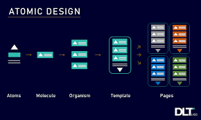
Brad Frost developed the Atomic Design methodology, which encourages the creation of interfaces as a hierarchical structure of components as instead of pages. The five distinct stages of the atomic design process come together to construct interface design systems in a more thoughtful and hierarchical way. Atomic design is a mental framework that enables us to picture our user interfaces as both a single unit and a collection of elements at the same time. It is not a linear process. The hierarchy of our interface design strategies places significant importance on each of the five stages. They are:
Atoms: The fundamental components of matter, which include input fields, buttons, and labels.
Molecules: Atomic combinations that create useful parts, such as a search bar (button + input field).
Organisms: Complex components, such as a header or a product card, composed of molecules and/or atoms.
Templates: These are features at the page level that organize elements in a layout.
Pages: Specific examples of templates that display how a user interface appears with actual data.
Atomic design is a web design process that will assist you in improving the consistency of your designs and optimizing your productivity. Web design is divided into smaller, reusable parts known as "atoms" by the atomic design. Subsequently, these atoms unite to generate "molecules," "organisms," "templates," and "Pages." Using the Atomic design process is similar to creating Lego structures. We are able to produce a design system that is reliable, effective, and user-friendly by using the atomic design.
The advantages of atomic design
Consistency and Efficiency: The efficiency and consistency of atomic design are two of its main advantages. Designers can focus more of their time on creative elements and less time on tedious tasks by utilizing reusable components. Furthermore, team members' communication and collaboration improve as a result of atomic design. It simplifies the design process by enabling individuals to focus on particular atoms or molecules, cutting down on pointless communication.
Scalability and Reusability: The creation of atoms, which are highly reusable across different projects, is the first step in the atomic design process. This saves time and effort. By emphasizing a bottom-up methodology, atomic design also facilitates scalability, enabling designers to produce flexible and adaptive solutions.
Enhanced Productivity and Lower Costs: Atomic design ensures a constant user experience while simultaneously improving productivity and cutting expenses. Designers can increase productivity by streamlining the design processes and concentrating on producing smaller, reusable components. This method reduces the expenses and resources needed to build a website or application.
Safeguarding Your Design: With the help of an atomic design library of reusable, modular components that can change and adapt over time, your design system is safeguarded. This is especially beneficial in larger businesses where team members may shift over time, as it makes it easy for any designer to comprehend and make adjustments in the future.
Creating complex designs: For creating large-scale projects, multi-platform apps, or complex online applications, atomic design is perfect. It facilitates effective management of such projects' complexities. For smaller projects, basic websites, or heavily customized designs, it might not be as helpful. The precise needs of your project will determine which methodology is best.
Mastering Figma Auto Layout:
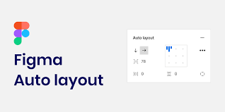
What is Auto Layout?
Figma's Auto Layout feature makes it simple for designers to produce responsive and adaptable designs. It facilitates the building of adaptable and scalable interfaces by allowing components to adjust dynamically when the content does. Auto layout ensures consistent and visually appealing designs across a range of devices by automatically adjusting the layout in response to changes in content, screen sizes, and orientation. It enables the development of relationships and establishes guidelines for how components should be sized and positioned in relation to the container as well as one another.
Key features of Auto Layout:
Responsive Designs: You can make designs with Auto Layout that automatically adapt to fit the content contained within them. This is very helpful when designing responsively, where elements must adjust to various screen sizes and orientations. It also guarantees dynamic resizing of components according to the content they hold. For instance, a button will enlarge to accommodate the text label's length inside of it.
Padding and spacing: You can adjust the padding and spacing between items using Auto Layout, which guarantees aesthetically beautiful and consistent layouts. This functionality comes in very handy when working with buttons, cards, and lists when it's important to keep the spacing consistent, thereby establishing uniform padding and spacing between the components.
Alignment: It is easy to align and distribute things within a frame with Auto Layout. This is essential to keeping the design neat and well-organized. It helps to align objects vertically and horizontally to the top, bottom, left, right, or center of a container. It is also helpful in arranging the contents of a container so that there is equal space between each item. This is very helpful for designing layouts that are balanced.
Resizing: It is suitable for responsive design because components dynamically adjust in size. It selects between fill modes, in which components grow to occupy available space, and fixed sizing, in which components stay at a given size. It Sets minimum and maximum size limits for components to prevent them from resizing to an excessively tiny or large size. It also Maintains an aspect ratios for components while making sure they resize proportionately.
Advantages of Auto Layout
Efficiency: Saves time and effort throughout the design process by reducing the need for manual adjustments.
Consistency: improves the overall appearance and feel of the design by ensuring that all components have similar spacing, alignment, and sizing.
Flexibility: Makes your design more robust and versatile by enabling the creation of designs that easily adjust to various screen sizes and content variations.
Designers can significantly enhance their workflow, produce more responsive and adaptive designs, and guarantee a consistent user experience across many platforms and devices by becoming proficient with these essential Auto Layout features.
Creating a Responsive Product Card Using Atomic Design Principles and Auto Layout: A step-by-step guide.
Step 1: Setting up Your Figma File
Open Figma and create a new design file by clicking on Create New.
Create layers for molecules, atoms, organisms, templates, and pages.
Step 2: Atom Design
Make a button component by adding background color and text.
Design a simple text label element.
Create an input field and enter a placeholder text.
Step 3: Building Molecules
Combine the button and input field to create a search bar molecule,
Apply Auto Layout to the search bar to make sure it adjusts to reflect changes in the text.
Step 4: Constructing Organisms
Design a product card by assembling atoms and molecules.
Insert a placeholder image.
Include text labels for the product's title and description.
Include a price label and a call-to-action button.
Use Auto Layout to make sure that the product card adjusts its size dynamically according to the content.
Step 5: Creating templates and pages
Arrange several product card organisms to create a template for a product listing.
Use Auto Layout to keep the distances between product cards equal.
Using the template, create a page instance and add actual product data.
Step 6: Testing and Iterating
Adjust the frame size to test the design and make sure the components adjust as intended.
Ask stakeholders for their views on the design, then make changes depending on their comments.
In Conclusion
Through the use of Figma's Auto Layout tool and the concepts of Atomic Design, designers can effortlessly produce user interfaces that are scalable, consistent and responsive. This method guarantees a consistent user experience across all devices and screen sizes while also improving design efficiency.
Take your design productivity to the next level by implementing these methods in your next project.